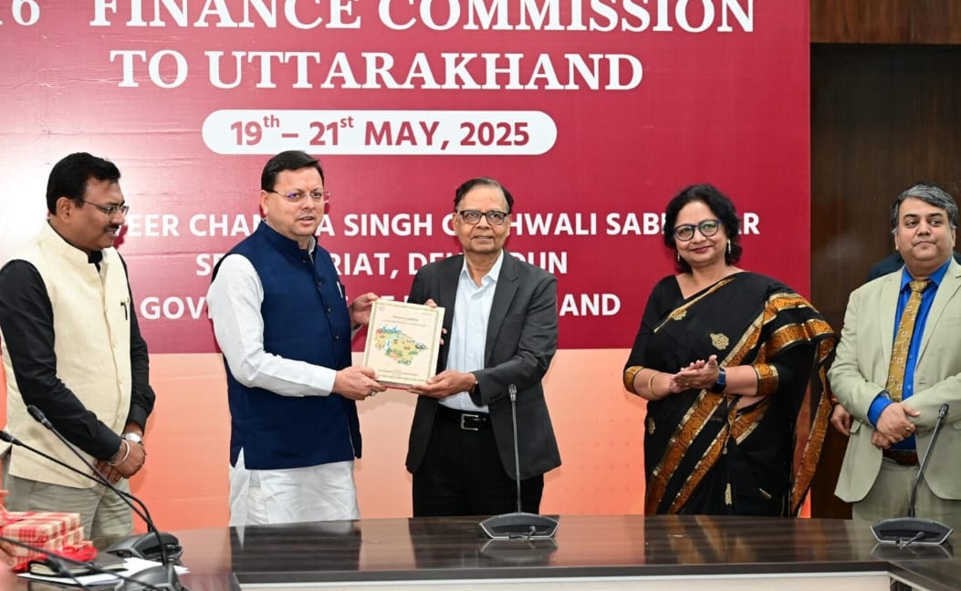
When you work in design long enough, you realize that some projects are not just about creativity — they’re about responsibility. This was one of them. We got the opportunity to design the front and back cover of the official Memorandum to the 15th & 16th Finance Commissions for the Doon Ventures Digital Solutions Pvt. Ltd. & designed for the Government of Uttarakhand. This wasn’t just another book. This was a document that represents the financial and development vision of an entire state. And to top it all off, it was formally launched by the Hon’ble Chief Minister of Uttarakhand, Shri Pushkar Singh Dhami Ji — which made the whole experience even more special for me.
From day one, I knew the cover had to be formal, respectable, and rooted in the state's identity — without being boring or overly generic. My goal was to communicate importance without overwhelming the viewer. I started by researching past finance commission documents and government publications. What stood out was how most lacked visual personality. I wanted this one to stand apart — not just be read, but remembered.
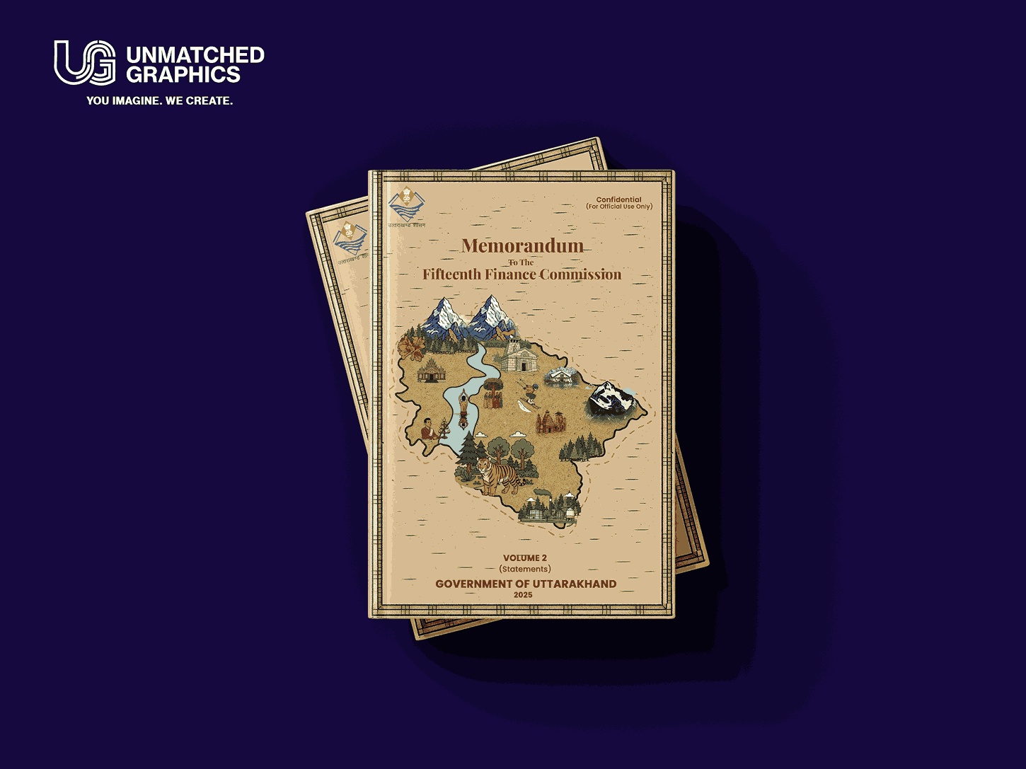
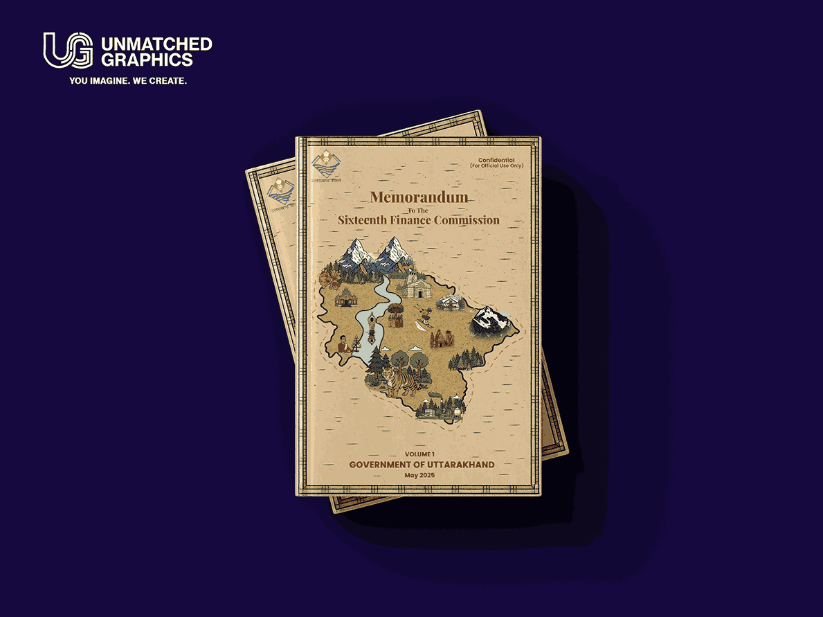
I worked with a clean layout, soft neutral tones, and a strong visual centerpiece — a map of Uttarakhand — symbolizing the document's focus. I carefully curated typography that felt formal and timeless, not trend-based. The layout was meant to guide, not distract. The goal was visual trust, not visual noise.
This wasn’t just about aesthetics — it was about alignment with government expectations, timely revisions, and precision. The process included feedback rounds from both Doon Ventures and internal state authorities, which helped tighten the final output. After design approval, everything moved fast. The document was printed, prepared, and then came the moment we all worked toward.
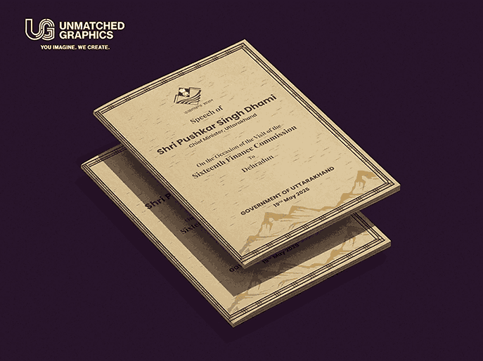
Seeing the Chief Minister of Uttarakhand hold the report in a packed hall, handing it over to the Finance Commission — with my cover design front and center — was a moment I won’t forget. It wasn’t about recognition. It was about contribution.